Pick Your Brand or Logo Colors that will Attract Your Customers
Choosing the right colors is part scientific and part aesthetic, but this doesn’t mean that the process of choosing these colors is a wishy-washy one. Don’t be color blind about this process. Colors have meaning, so once you have an idea of what your brand stands for, begin the process of selecting a color pallet that works with that message.
If you need information on Establishing Yourself or Your Company as a Valuable Brand, check out the Article Here.
How Colors Affect Consumers’ Choices

So what color will attract customers to your brand? No one color fits everyone’s brand or message; let’s start with a few fun facts: Did you know that restaurants use red tablecloths and napkins so often because red is thought to make people hungry? Or are brown diamonds called “chocolate” diamonds because it has a much better connotation and makes people want to buy them?
These are just a few examples of why the color you choose for your product is so important, and make no mistake – there have been tons of studies on the science behind choosing the right color for all products out there on the market. When you’re designing your product, you can’t just haphazardly decide you want it to be blue, red, or yellow. Instead, you have to consider every color so that the right one is chosen in the end.
Color Association
Often called color psychology, most people are aware of many associations between various colors and what they are thought to represent. This is why, for example, red is often considered a symbol of passion, and white is usually a symbol of cleanliness. Researchers have also noticed other links between certain colors and certain behaviors. These include:
- Impulse buyers respond easily to colors such as red, black, royal blue, and orange.
- Teal and navy blue are the colors that work best on bargain hunters.
- For shoppers who want traditional clothing options, soft colors such as sky blue and pink are what they respond to most.
- Brown is never used for packaging for produce because it makes people think of fruits and vegetables that are rotting or overripe.
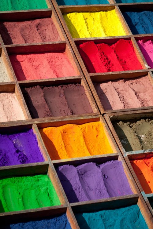
Of course, it isn’t just about the emotions that certain colors bring up. It’s also that these colors identify with our expectations from certain products, and companies spend a lot of money on finding the right colors for their product because they know this is true. Different colors can also produce different reactions in people according to where they live and even their culture. As a general rule, however, each country shares similar reactions when it comes to products and the colors used to make them.
In-Depth Color And Logo Review
Let’s take a look at some popular colors and how they can affect the buying patterns of the typical consumer. We will also look at some of the very famous companies who use these colors in their products, services, and advertising:
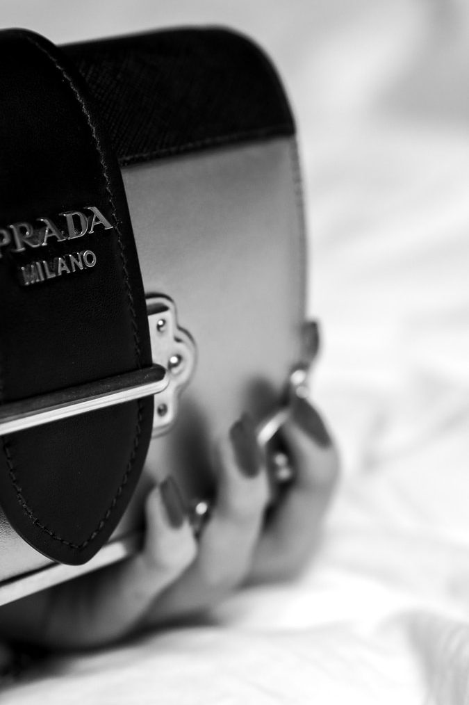
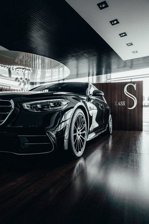
Black: Bold and powerful, black can conjure up feelings such as elegance, darkness, control, and even sexual feelings. It is used by companies such as fitness centers, alcohol manufacturers, and makers of occult-like items.
Warning: If used too much can be overwhelming, depressing, and cold.
Companies: Disney, Louis Vuitton, Gillette, Cartier, Gucci, Coach, and Prada.
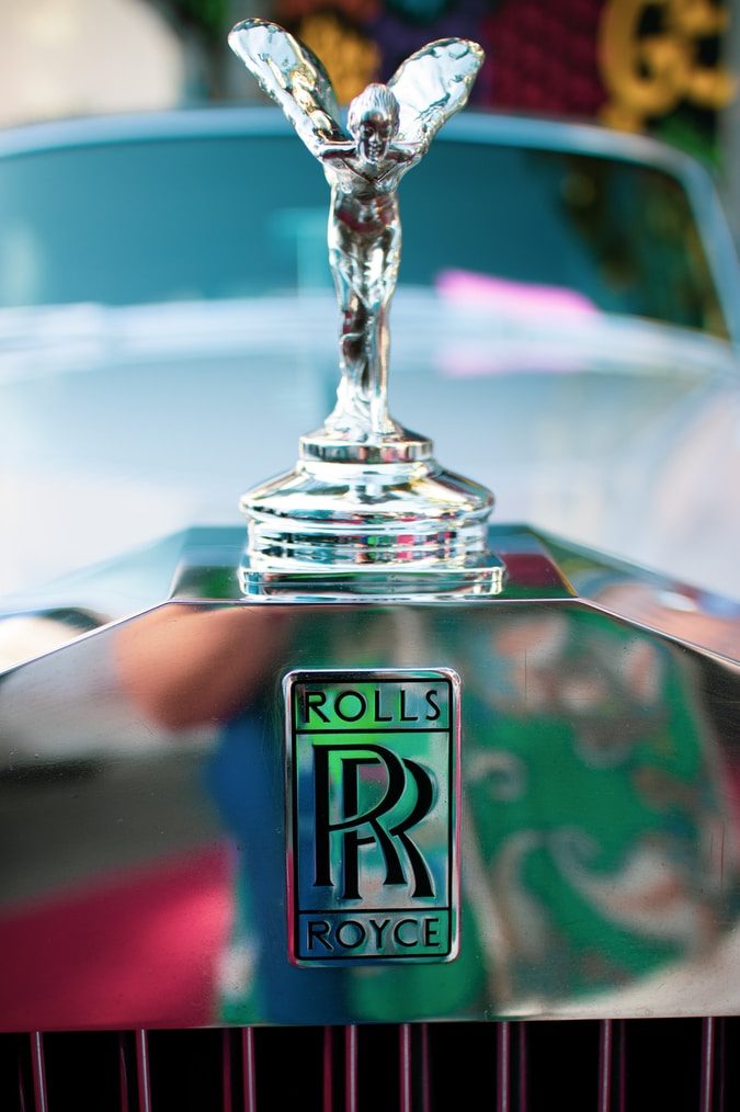
Gray or Silver: Usually associated with practicality and professionalism and efficiency and formalness. Some of the companies that use gray or silver include car companies, payroll services and corporations.
Warning: When used alone, it could just feel like a shadow and be undefined.
Companies: Nissan, Apple, WordPress, and Nintendo.

Purple: Magical, sensual, luxurious, royalty, and even mysterious; this color is often used for finance companies and companies that offer services to the military.
Warning: Lighter shades can feel feminine, and people tend to love or hate this color.
Companies: Yahoo, Crown Royal, Craigslist, Hallmark, Taco Bell, and Welch’s grape juice.
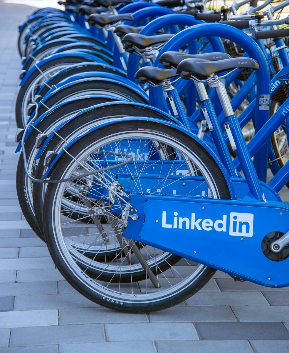
Blue: It can signify trust, masculinity, and authority, as well as tranquility and a sense of being protected. Blue has been used to promote products and services from yoga studios, financial advisors, and companies that make safety products such as goggles.
Warning: Watch your shades when as it gets darker can be the same as black, overwhelming, depressing, and cold.
Companies: that use blue in their logo Dell, General Electric, Ford, Facebook, JP Morgan, Oral B toothbrushes, and the website LinkedIn.
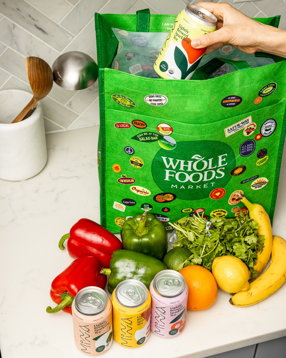
Green: This color is used to portray a sense of nature, maturity, and calmness, and it has even been known to lower blood pressure and help people relax. Can be easy on the eyes. Companies using this color in their marketing efforts include companies such as spas, those that work to improve the environment, and health-related companies.
Warning: Green has a lot of great quality but because but should not be used to create a sense of urgency.
Companies: Whole Foods, Starbucks coffee, Hess, BP, John Deere, X-Box, 7-11, Holiday Inn, and Spotify.
Yellow: is associated with playfulness, happiness, youth, and energy, but it can also symbolize danger. Companies that use this color include those that make safety equipment and tools
Warning: Using too much can make a customer move on quickly from a location or website however it is good for a call to action button.
Companies: McDonald’s, Shell, Hertz car rentals, Best Buy, Denny’s, Sun Chips, Nikon, and National Geographic.

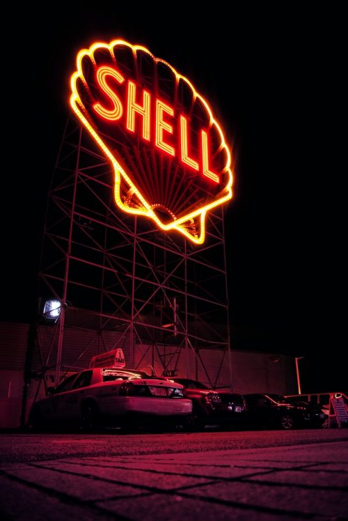
Orange: symbolizes warmth, cheerfulness, friendliness, and high energy, and it has been used by companies that include beauty products and products that are trying to attract teens and young people.
Warning: Because it can create high energy too much can also create anxiety.
Companies: Gulf, Orange Crush, Starz, Payless Shoe Store, Nickelodeon, Sling and Fanta orange drink.
Pink: As you can guess, pink is associated with girliness, peace, and romance, and the biggest users of this color are companies that are trying to market their products and services to women
Warning: Overused can feel offensive and limit your audience.
Companies: Lyft, T-Mobile, Dunkin Donuts, Baskin Robbins, Barbie, Johnson & Johnson.
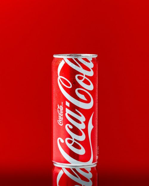
Red: Associated with anger, danger, passion, and even confidence. Some of the companies that have used this color in their advertising include dating services and restaurants.
Warning: While it provides a sense of urgency, and energy, but like orange too much could make you feel anxious or overwhelmed.
Companies: Coke, Time Magazine, Heinz ketchup, Texaco, CNN, Exxon, CVS Pharmacy, and Toyota.
Brown: Above all else, brown signifies strength and reliability. It gives us a connection to the earth and resilience, dependability, security, and safety.
Warning: Shouldn’t be chosen by hotels because it may produce feelings of dirtiness in the consumer.
Companies: UPS, Cracker Barrel, M & M’s, Cotton, and A &W.


White: Fresh and new, white is usually associated with simplicity, purity, and peace. Companies such as ice cream vendors often use white in their promotional and marketing materials.
Warning: Too much can give a very blank sanitary untouchable feeling.
Companies: Guitar Hero, BMW, Addidas, and Nike
Since the reactions people get from certain colors are not the same across each culture and country, it is important for companies to consider their audience and how to market their products and services. Again, it isn’t just a haphazard decision but a well-thought-out decision that can make a big difference between customers buying your products and customers leaving them on the shelf.
Successful Companies Make Color a Focus
All good brands take a painstaking approach to designing the perfect packaging for their products, and deciding on which colors to use in these packages will go a long way in determining how successful they are once they get on store shelves. Indeed, certain colors bring up certain images in a customer’s mind, which is why both the product itself and the packaging have to be the color most appropriate depending on which images the company wants the consumers to conjure up in their minds when they look at the product.
For instance, even drug manufacturers will often use colors such as light blue for their sleeping pills and colors like red or bright yellow for their stimulants. In fact, studies have shown that roughly 85% of consumers say that the color of a product was the main reason they bought it. That number goes up to 90% when they’re talking about impulse items, such as chewing gum or breath mints. It works the opposite way as well – consumers often are turned off by a particular product simply because of the product’s or the package’s colors.
Some Interesting Statistics
Colors have a lot to do with your marketing campaign’s efficiency and effectiveness, including the color of the product itself, the packaging, and even marketing materials such as flyers, stationery, signs, and business cards. Companies pay millions of dollars for a creative agency to create the perfect logo for them. The colors in that logo directly affect its ability to put clear-cut images and expectations into customers’ minds. If you’re not yet convinced about how important color is to brand reputation and brand recognition, consider these statistics:
- Ads in color are read 42% more often than ads in black and white.
- More than 90% of consumers say that visual appearance is important when choosing a particular product.
- People usually reach a decision on a particular product in 90 seconds, and most of their decision is based on color alone.
- Roughly 85% of consumers have purchased something just because it was a certain color.
- The main colors used in products and promotional materials for those products are red, blue, yellow, orange, purple, and green.
Logo
Even developing a logo is a time-consuming process because each and every part of that logo, as well as every color used in it, means something and symbolizes something to the company it represents. If you ever want to read something interesting, go online and look up why your favorite company is using the logo they’re using. You’re likely to be surprised that both the design and the colors used in the logo all mean something specific, and all of it is personalized to that particular business, which is why no two logos are ever alike.
Conclusion On Choosing Colors
Color psychology is real, and some colors have even been known to cause a certain physiological response in many people, which proves to you the power of color when it comes to marketing and promotional efforts. Think of it as a color wheel, with each color signaling something new and each one being used to produce desired results.
The study of colors is still being studied and even debated, but most people agree that color psychology is an important part of a company’s image and how successful they are at promoting their product or service. Each color means something different, and we know color psychology works because the proof is in the pudding. Companies that haphazardly put together their marketing campaigns and product packaging will never be as successful as those companies that do.
4 Great Online Color Palette Tools
We have put together some tools for you below. The video below will walk you through each one. I have also put in links to them below also well as a PDF that can be used for reference when creating your color pallet.
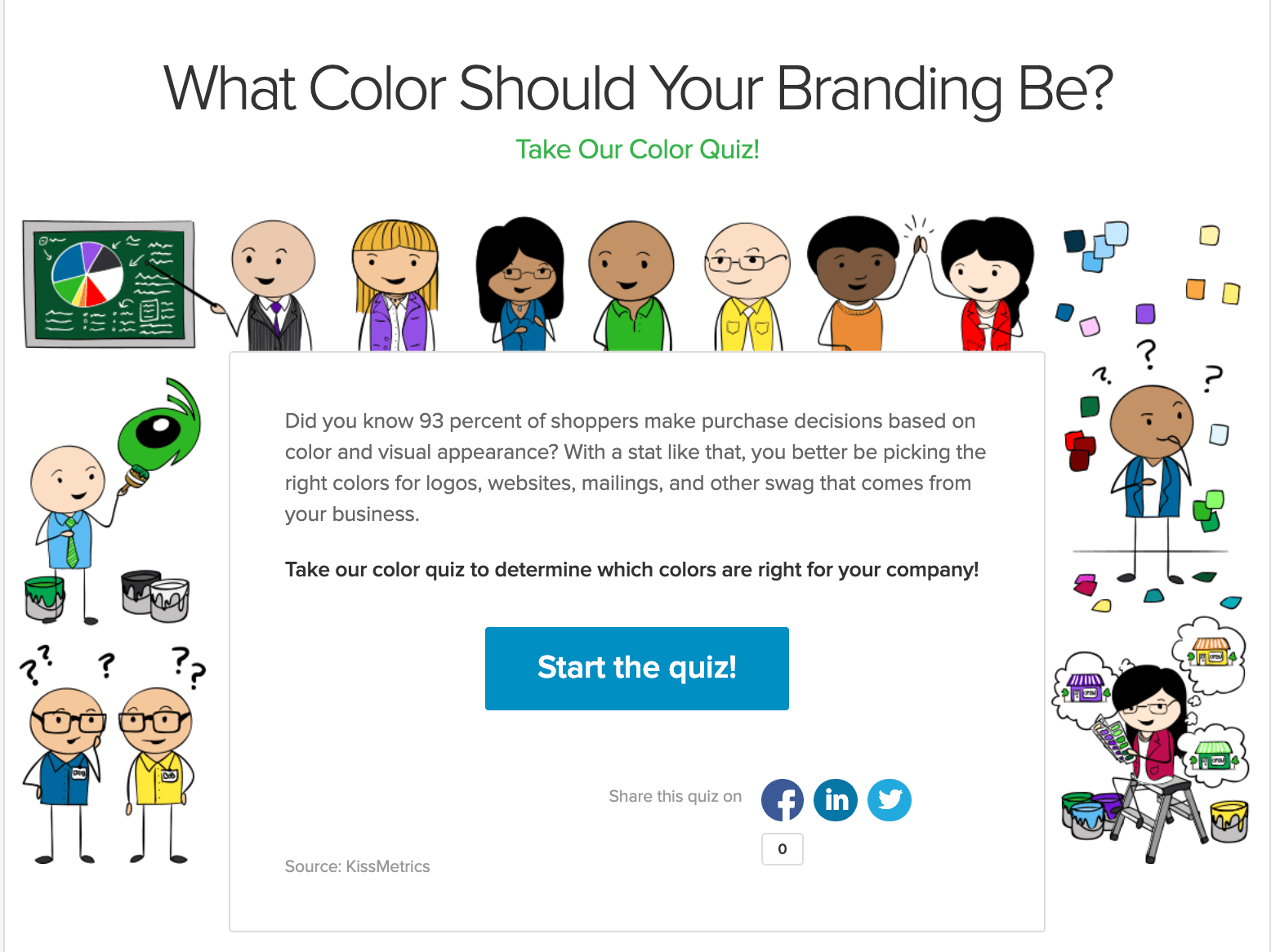
Grasshopper Color Quiz
Tool #1
If you need a kick start a fun tool by the Grasshopper asks your 7 questions to select one color try their
Adobe Color Tool # 2
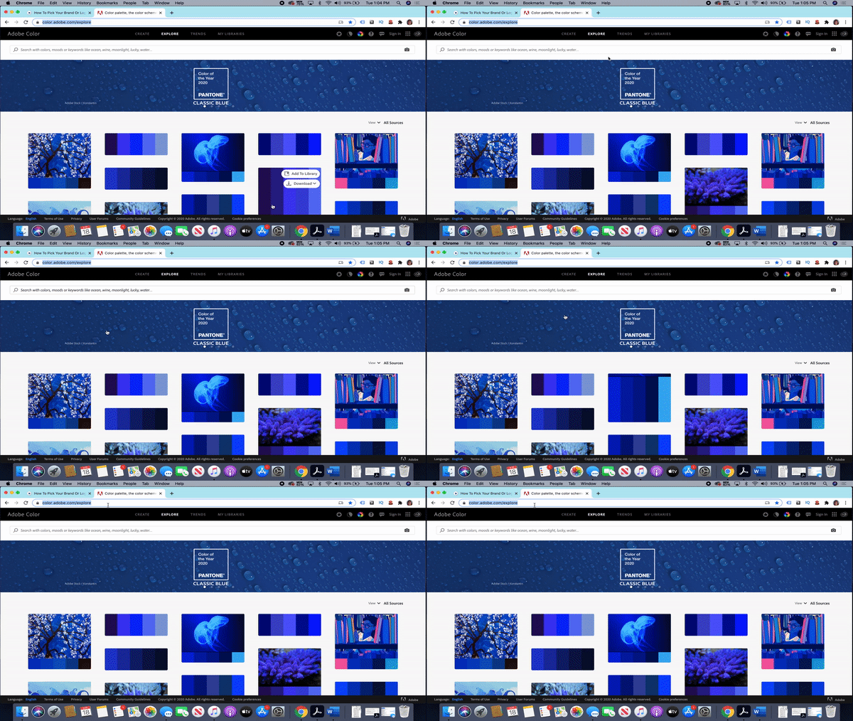
Another great tool for inspiration is Adobe Color. With this tool, you can explore via the color of the year, trends, a specific color, or even a word like ocean, wine, or happy. Also, you can use their color wheel to fine-tune the color shades or compatible colors.
Canva Color Pallette Tool #3
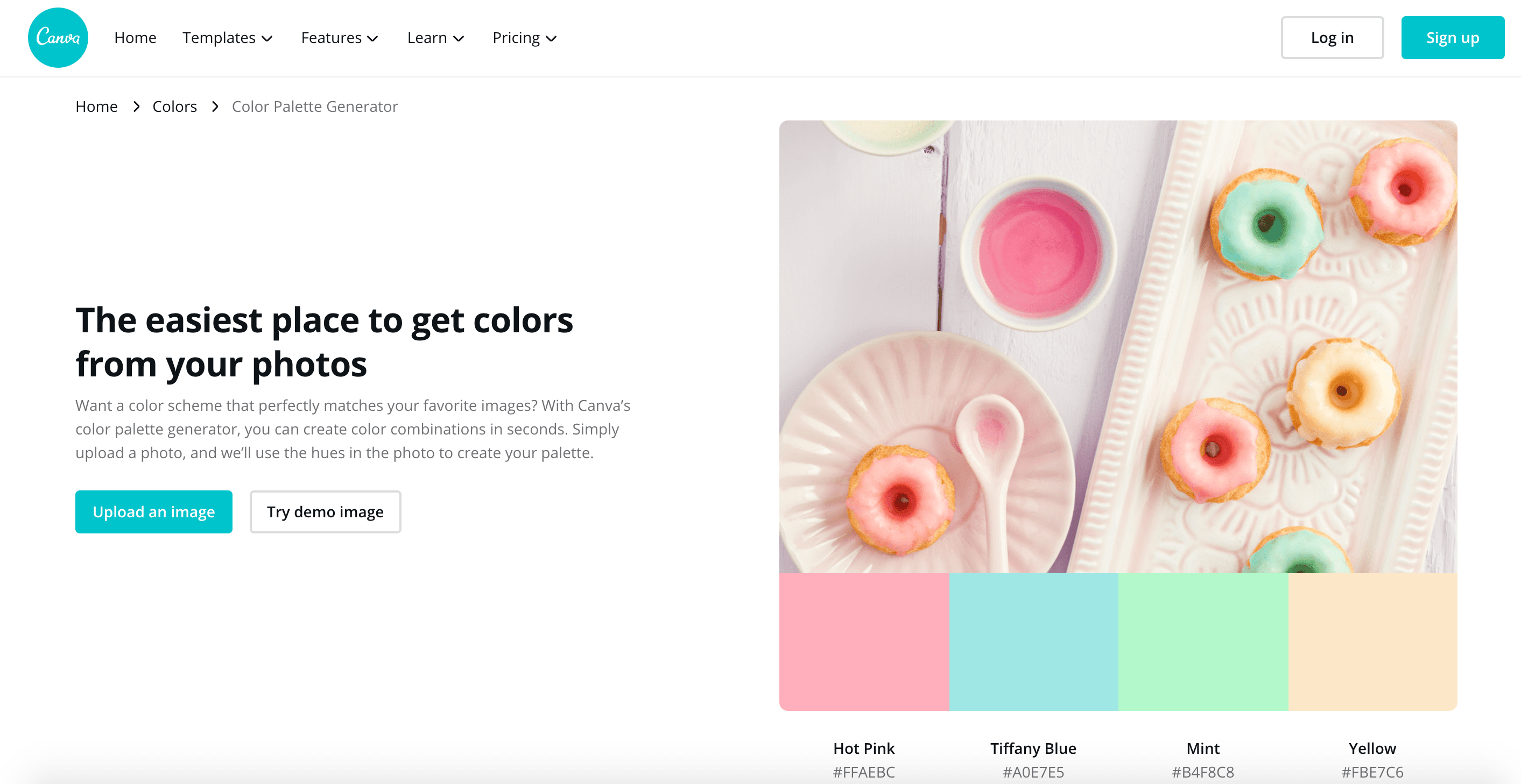
Canva has some free and paid tools you can use for creating your color pallet but also can be used for creating social media content. With this tool you can upload an image like a logo to generate your pallet
Coolors Pallette Tool #4
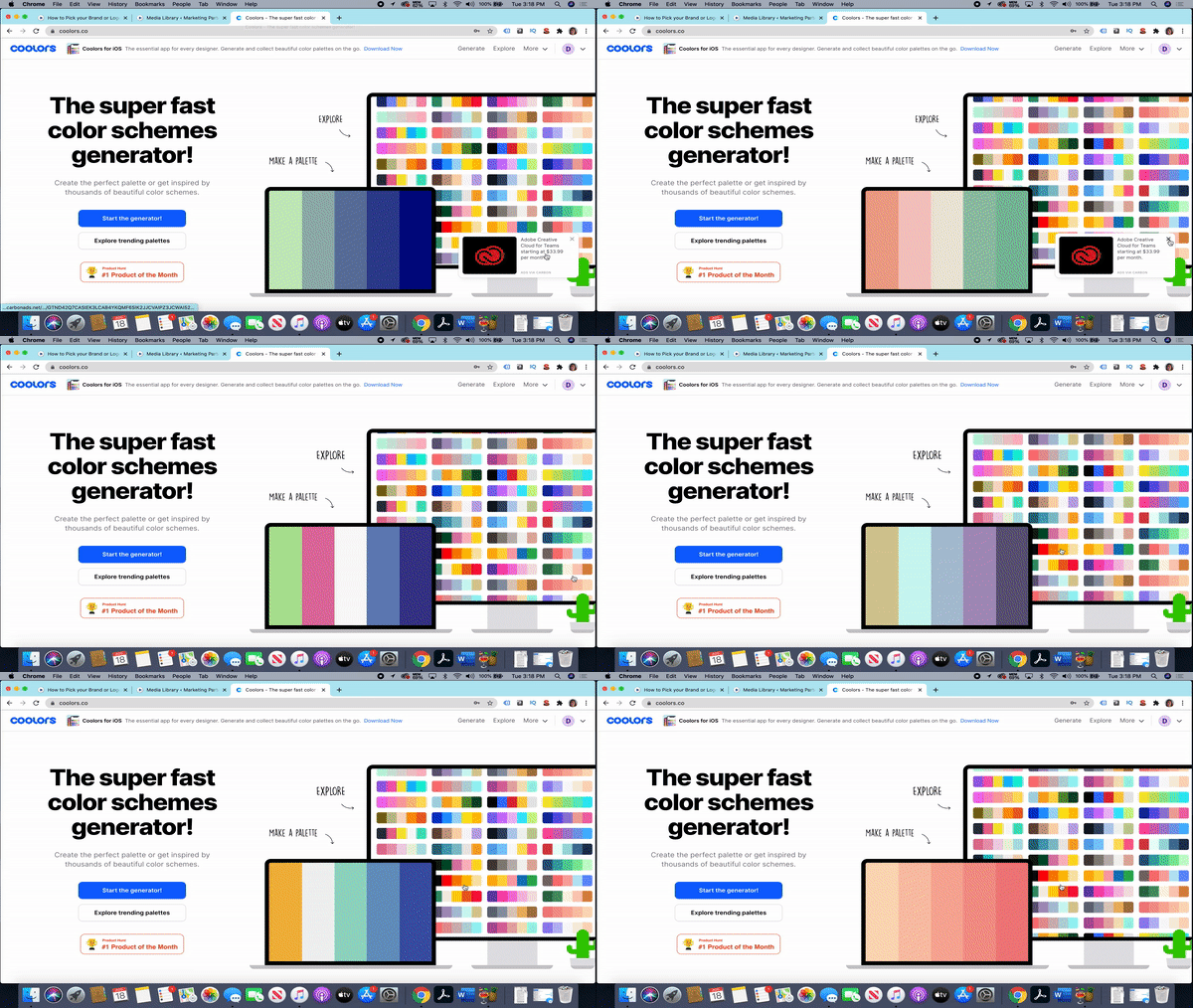
Coolors is a free online tool that will allow you to create an account and save multiple pallets. You can start will one color and find accents or start with an uploaded photo.
Subscribe To Download
Your Free Checklist
“Create a Brand Guide“
Use the following checklist to pick the colors, fonts, images, and emotions you want representing your brand.
We are here to help business owners just like you. Our mission is to help create easy-to-follow roadmaps customized for their business. Hire us to be your GPS, we will analyze where you are and map out a path to your desired destination.
Get Started Today!
If you found this content useful, please rate this article below. If you would like to comment or be notified when we add more content, just register click on the button below.

